What is IBM Event Streams?
IBM Event Streams is IBM’s Apache Kafka offering. Apache Kafka is an immensely popular open source messaging software which was released by the Apache foundation in 2011. The Event Streams team provide Kafka as enterprise software (on-premise) and as a service (SaaS) with add fully supported capabilities such as an award-winning UI, schema registry, REST API and connector library.
My role
User Experience Designer
Objectives
- Enable IT Administrators and Developers to connect their applications with Event Streams.
- Maintain a current User Experience within the IBM Design Language that is consistent with other IBM products.
- Plan the future of Event Streams and organise the Event Streams roadmap competitively.
Summary
Getting started with Kafka isn’t typically a pretty sight. When the product’s value is getting messages moving from one IT system to another, users struggle to find a way to see Kafka working. The way that Event Streams helps these new users achieve their first bit of value is by providing a starter application that connects to Event Streams - letting them see messages sent to and recieved from a Kafka topic before they connect their real apps and services.
When I joined the Event Streams team, the Starter App was in its’ first iteration. In my time on the team it had several new iterations - we added it to the Event Streams SaaS product, updated it to use the Carbon X design language, and made it compatible with other Kafka products, whether open source or competitor. THe experiences around the starter app also changed - following user feedback that our message browser consumed a lot of resources, we redesigned it to achieve the same value in a much lighter way.
What was the getting started experience like to begin with?
First, the user navigated to the starter application page and specified the name they’d refer to their application by, and the Event Streams “topic” it should be connected to.
There were some issues with these interactions:
- The call to action on launch and within the first page were “Generate application” - which didn’t align with the users’ task of “get to know Event Streams”
- Users who were new to Kafka weren’t introduced to applications or topics, or what they did, before they had to work with them
- Asking users whether they wanted the application to produce, consume, or do both was neither explained nor often used
Next, the user would wait for the starter application to be generated and download it.
The issues with this interaction were:
- the countdown while the app was generated was not prominent enough
- downloading a .zip file both interrupted the flow (as the user had to navigate to and unzip it)
- users weren’t educated as to the contents of the .zip file; as an educational experience, the opportunity to educate users on the required properties and authentication methods was not used
Finally, the user runs the command, waits for the application to start, opens the starter application and achieves their task of sending messages through a Kafka topic.
Improvement 1: Adopting the Carbon X design system
Carbon, IBM’s design system launched a new language and style in 2019 which meant that we had the opportunity to revamp a lot of the Event Streams interface. While the Event Streams interface itself came first, in 2020 we got the opportunity to apply some changes to the Starter app interface itself.
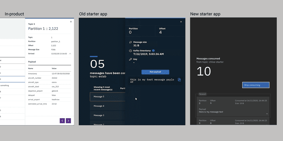
The old app
The new app
- Note the addition of “Newest” focal boxes to draw the users’ eye toward the most recent message either sent to or consumed from Event Streams.
- Note the addition of motion blur to express that messages are moving dynamically, especially in low-frame-rate situations such as when captured on video or experiencing low-bandwidth.
- We simplified the “custom payload” field and “start producing” buttons as we’d noticed that the original, large “play” button wasn’t always spotted.
One really key improvement helped users distinguish from the Event Streams interface and the Starter App interface.
In the Event Streams interface, the content of a message is explored by opening a side panel the right of the screen. This was originally also used in the start application interface. In this improvement work, we re-designed the interaction in the starter app to diverge from the Event Streams UI and expose more message details by opening a caret instead.
Improvement 2: Open-sourcing the starter app
Open-sourcing our starter app was not just a publicity stunt - re-architecting it would provide several user benefits:
- Allow users to switch out the topic or instance of Event Streams the app was connected to
- Allow users to inspect, understand and re-use the code in the Starter app
- Allow non-Event Streams users to download the app direct from Github
- Allow us to version the Starter app independently from the product
- Allow users to understand the authentication methods both the starter app and their real apps would use
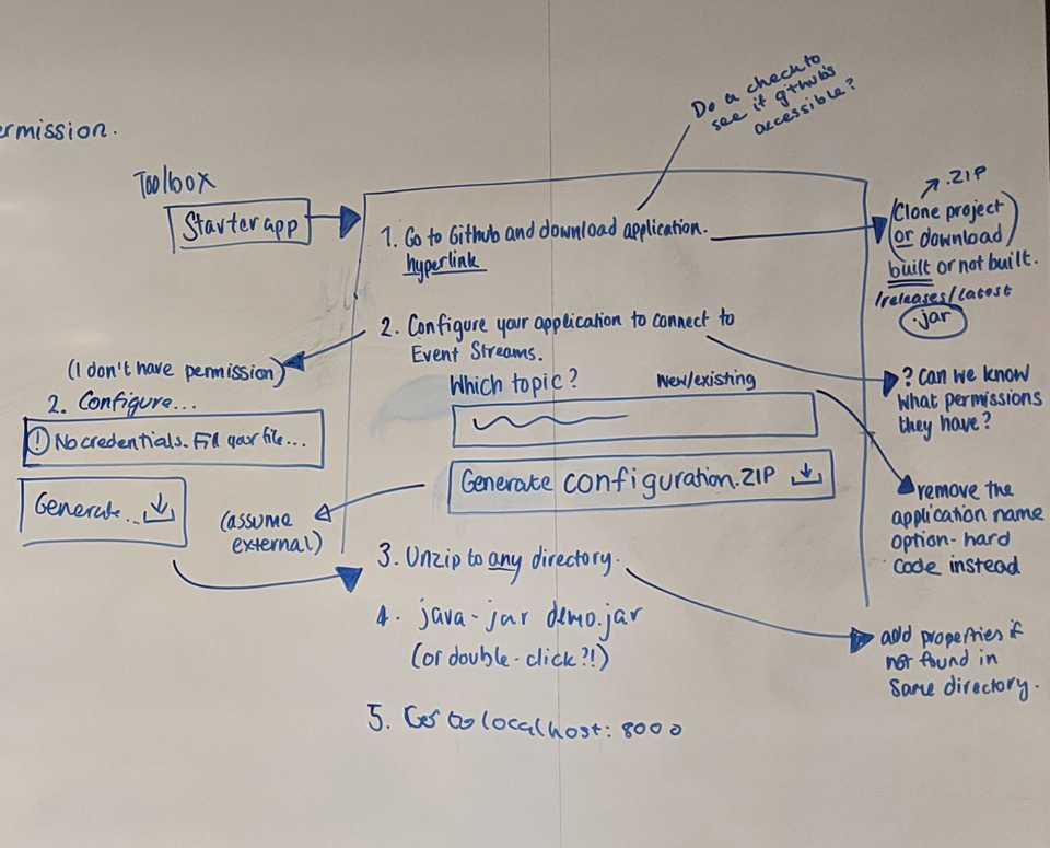
We knew that the starter app flow would be more complicated with its’ new home on Github, so we kept these screens, and the terminal screens in context with all of our mockups and explorations.
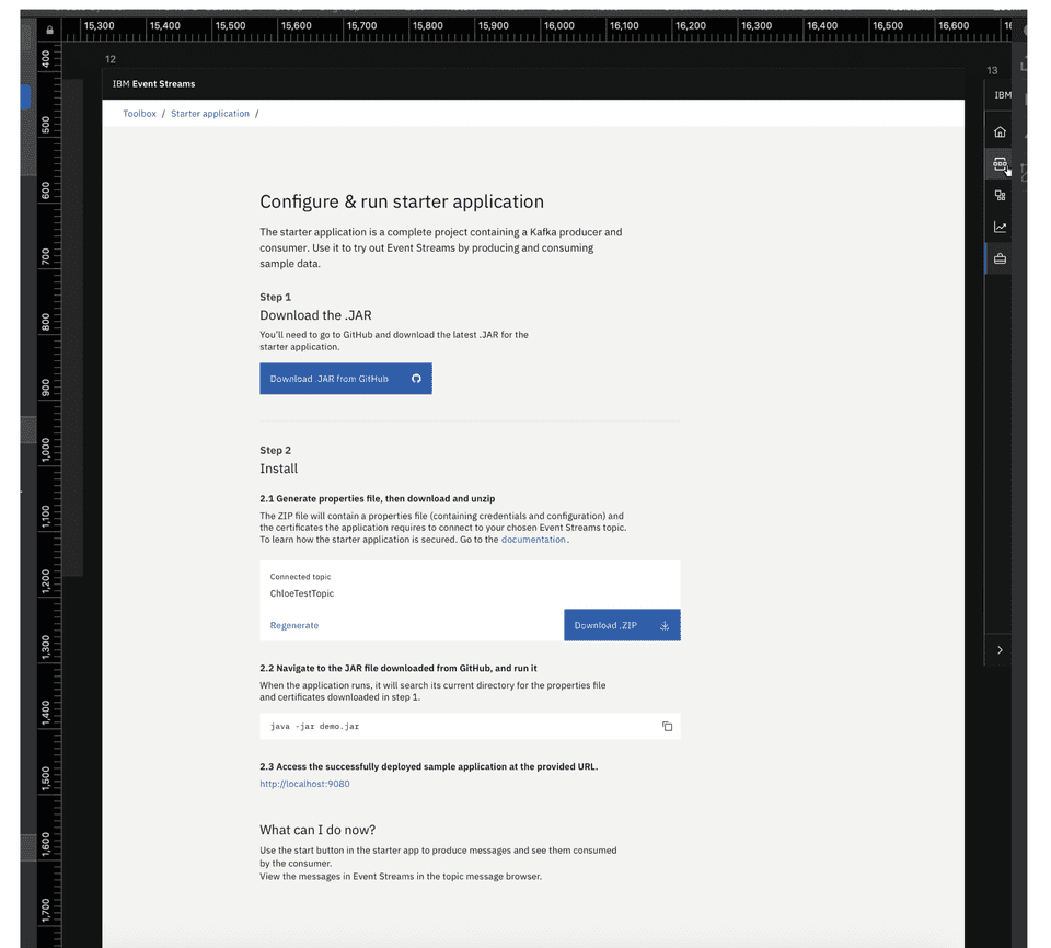
The new flow now:
- exposes the user to the kafka.properties file which they can edit to reuse the starter app with other instances of Kafka/Event Streams
- allows the user to go to a friendly “releases” page on Github, and interact with more code via Github should they choose
- Includes the whole Starter Application flow on one page, so that users know what to expect, and can jump ahead if they’ve done parts before
Finall, the starter app page now directs users to inspect their topic inside the Event Streams UI - so that their final learning moment teaches them how they’ll interact with real topics and apps in productive use of Event Streams.


