Joining Aveni
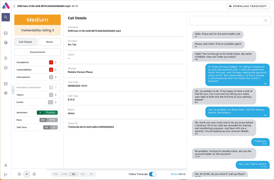
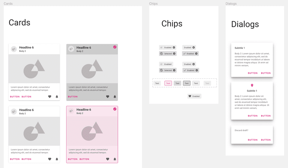
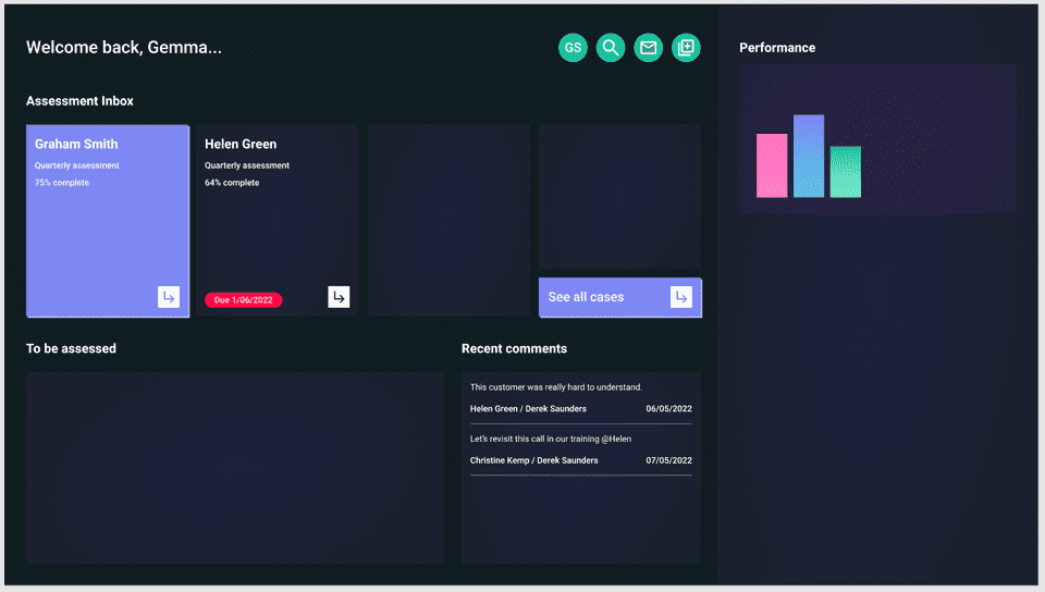
When I joined Aveni, the UI broadly used Material Design 2 with components available on MUI.com, plus a few odd exceptions. Without any regular design guidance or reviewing the UI roughly included functionality that had been designed by a contractor for them, with some usability issues, annoyances and inconsistencies.
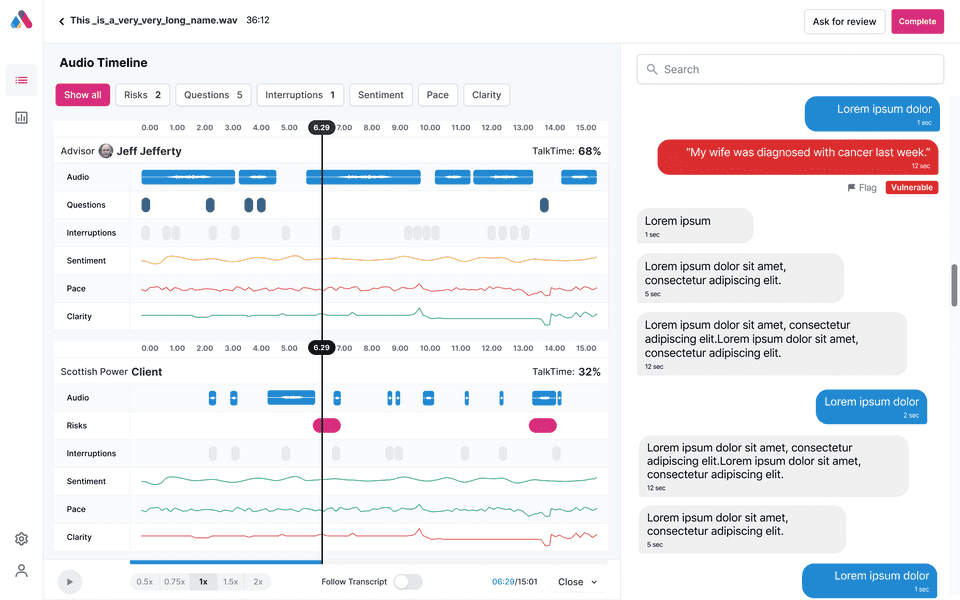
Unfortunately, without any specific front-end resource and therefore unable to customise components, they were unable to progress towards the more complicated and customised functionality they wanted, especially in relation to audio controls and data visualisation:
Unconvinced that much of the designed functionality was really necessary, I set out on a heuristic evaluation, identifying a list of minor usability improvements such as:
- scrolling and paginated areas employed on a scrolling page
- inconsistent typography
- poor information hierarchy
- lack of directed workflow, guidance or instruction (read about how I changed this here!)
Embracing Material UI
I resolved that most of the usability issues and lack of personality in the UI could be resolved by adopting Material UI more closely and paying attention to the implemented experience.
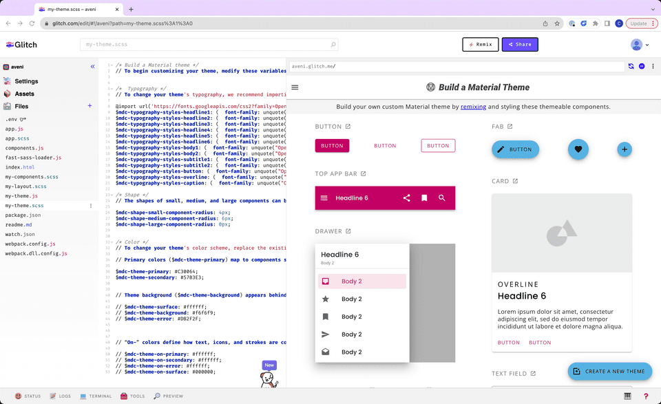
When my first design team member came on board, I needed to pay more attention to internal tools. I used Glitch to explore and then finalise colour rules.
I themed the Google-provided Figma Material UI library and created Figma components for us to use. This was a surprisingly sub-optimal experience!
Problems afoot
Soon enough, we faced further problems. Alongside Material’s heavy use of the primary colour and focus on mobile (not a device type of any interest to our users), I discovered that MUI were not planning to build components that we needed or support the newly released Material 3.0. MUI’s decision to diverge from the (sensible) restrictions that give Material UI its personality meant that our UI was becoming increasingly soulless, and we would soon be supported less and less by Google with design guidance. While I was happy to continue working with MUI, the hire of some front-end developers and a new member in my team was a great opportunity to pivot to a design system of our own.
Selling a custom design system to the company was surprisingly simple. With implementation time a constant complaint the efficiencies a design system offered, along with the opportunity to breathe life into Aveni, was welcome.
Commissioning
Our new design team member joined us and I used the design system evaluation and redesign project as an onboarding tool. I knew the new staff enjoyed UI work the most, had more UI skills than the rest of us, and would need a good opportunity to become familiar with the product. I created a project brief for the designer, suggesting a project plan, timeline and setting a few requirements for the output - timelessness & modernity.
I asked the designer to focus initially on the design language and principles that would underly the system, inspired by the strong principles which made IBM’s carbon make sense.
The designer’s first concepts clearly struggled with the existing Aveni brand colours. Tuning into the user demographic and seriousness of the risk & compliance and financial services sectors, they had toned down the primary pink and relied on the secondary navy blue colour which aged and ubiquitised the platform.
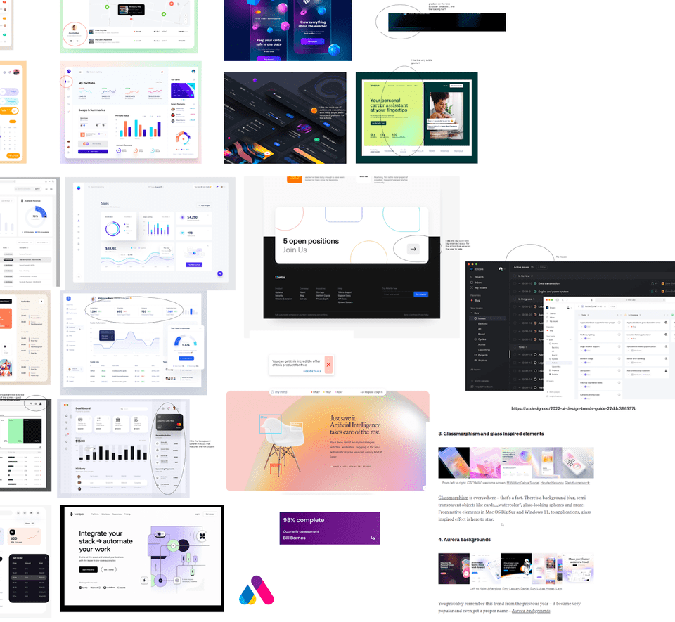
I directed the designer further towards my vision for a light but colourful, more modern platform by leading a group moodboarding session.
We couldn’t escape the glassmorphic dark UIs that were very trendy at the time, and entertained the option of a dark and light theme.
Unfortunately without a graphic designer to support the team, and not enough engineering resource to launch two themes at once, I had to direct the designer to focus their efforts on a light theme. I encouraged them to consider light glassmorphism and aurora trends instead, acknowledging also that these aspects of a design would age quickly.
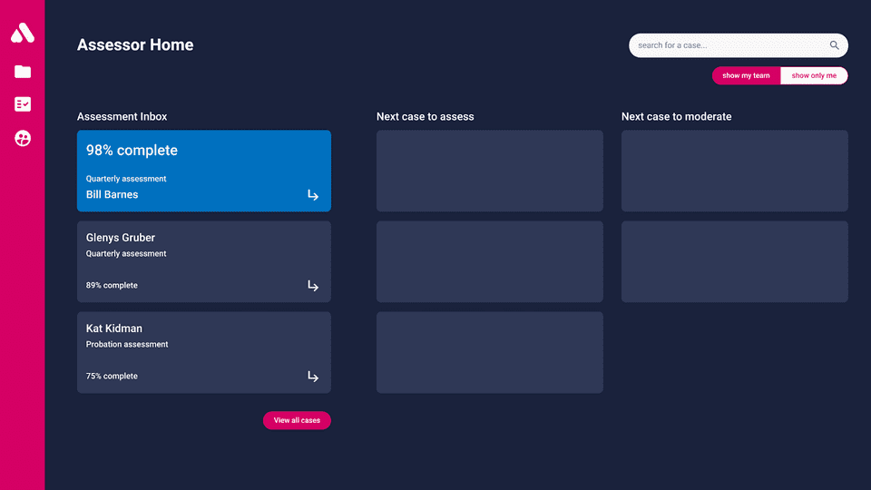
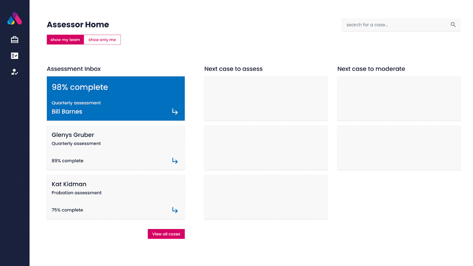
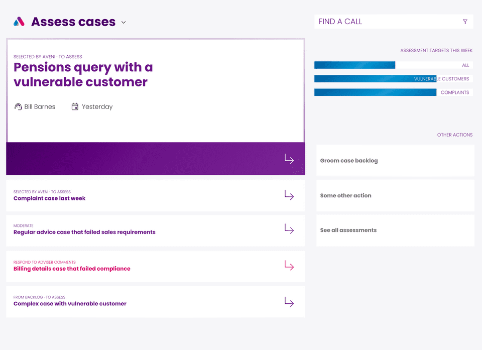
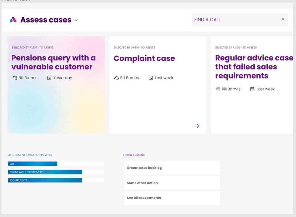
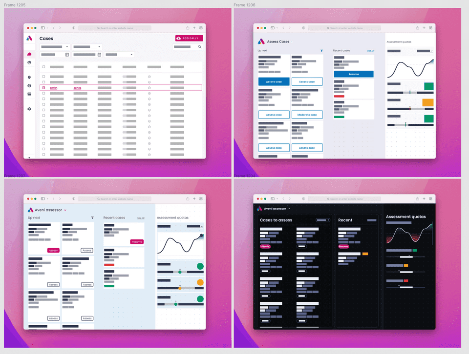
Both concepts hinged on introducing a new purple brand colour to the platform - which the designer had identified didn’t align with the user demographic. Struggling for direction, we shared 4 minified concepts with a panel of users and staff.
I asked the team to define the goals for the design team and use open questioning to identify the closest-aligned visual option:
-
Since we’d identified a year previously that the key to Aveni’s adoption and commercial success was providing a place for users to act on AI findings, Action-first became our key principle. We interpreted this in a range of ways applicable to a design language and system:
- emphasis (via colour, shape, motion, progressive disclosure, metaphor and content) is applied to the action the user should take in the particular interaction (as opposed to passive activities like data visualisation)
- distraction is avoided by creating single-function experiences that intuitively support task completion
- an opinionated range of features and configuration options keeps users out of the weeds and on the most efficient path
The user feedback we received confirmed our assumptions:
- Heavy use of the pink brand colour wasn’t attractive
- Dark UIs, while appealing to many, alienated a good proportion of users
- the cooler tonal palette allowed users to interpret the use of Red, Amber, Green more accurately
- action-oriented UX employing few tiles rather than dense tables attracted users looking to “get things done” Although a small and unscientific study, we moved forwards with the tonal blue direction.
Developing the new system
We split the system into a range of aspects:
- layout & behaviour
- components
- macro-components
- Typography foundations
- colour foundations
layout & behaviour
We identified that our action-oriented principles really aligned with the Assessor users of the platform. A good proportion of the market gains Aveni had made in the preceding year was due to the support for the user workflow we had begun to provide alongside our AI capabilities.
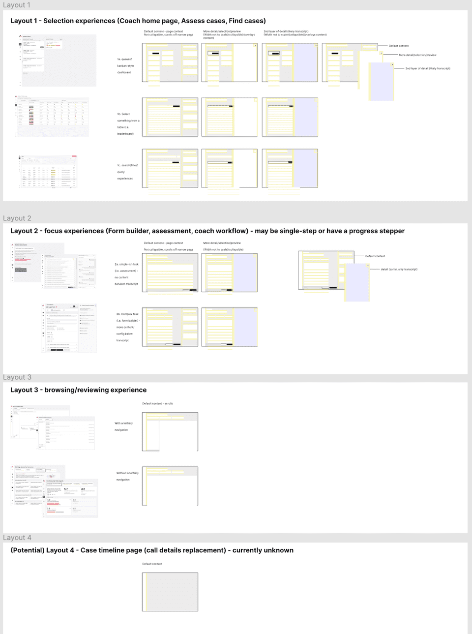
We created concepts of “centre stage” and “context” panes that would support users to focus on the task at hand and know where to go for additional context. This was a crucial pattern to establish as a call transcript was often a prominent (although not central) part of the interface.
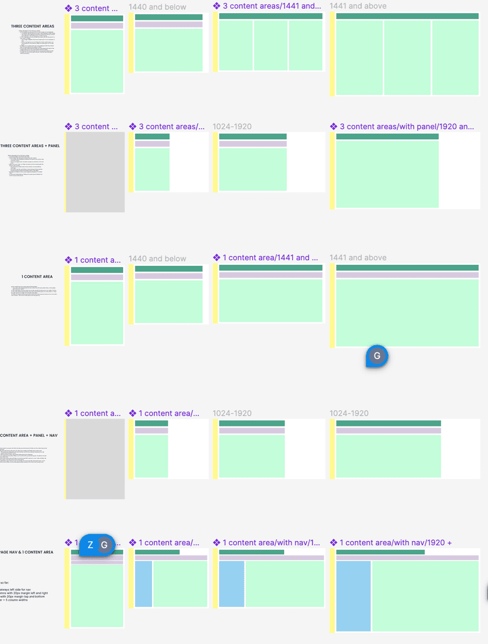
Once we established the existing range of layout patterns we had live, we condensed these into a reduced set of patterns to conform to moving forwards. We managed to make the selection more responsive in doing so and created responsive Figma templates to use.
Components
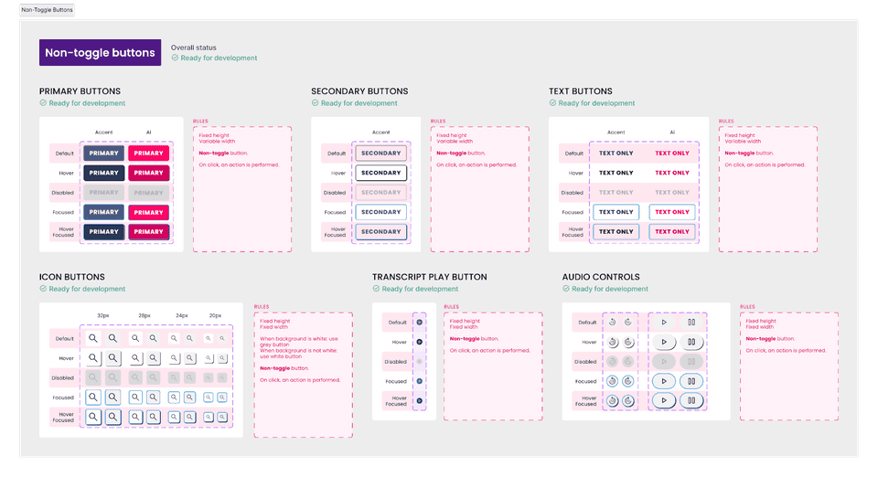
As there were a large number of components to build, we took the approach of designing and building in line with other projects. As time progressed, it became my role to police the unnecessary creation and change of components. I also directed the designers to use the figma features available to us (including variants, variables and styles) in the fullest way that was commercially sensible; including mentoring and finding learning materials for our junior designer.
I made sure that component usage guidelines were documented and encouraged the use of Jira to prioritise and track the work involved in the component work from a design and development perspective.
Macro-components
I’d learnt from my time at IBM that real time savings and consistency are achieved when guidance and tools are available beyond individual UI components.
I led by example creating a responsive header component, with a variety of variants as needed to support different pages.
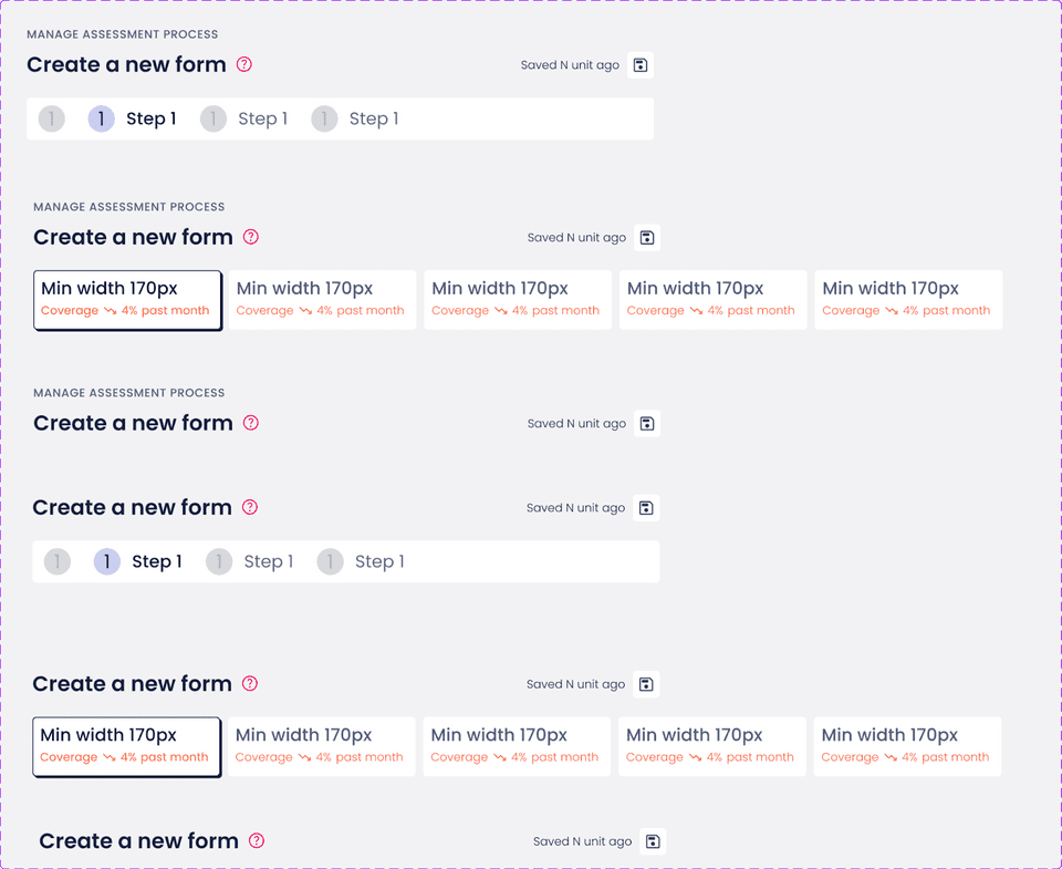
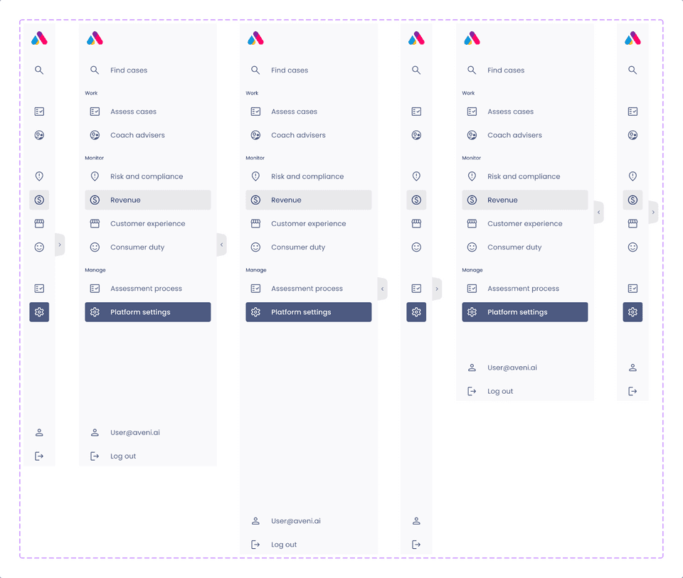
The team could then learn from this approach to build other combined components like navigations.
