Summary
IBM’s unified, open source design language is called Carbon, and can be used by anyone. It’s a key method IBM is using to align a huge number and range of user experiences. However, we realised that there is more to a consistent experience than colour, components, font, style and illustrations. As such, I’ve been involved in designing several UX patterns for common user flows or actions. These patterns are now in use by product teams all over IBM.
As a member of the IBM Cloud & Cognitive Services Design System Adoption Guild, I have authored user experience patterns and contributed to design guidelines across the company including into Carbon.
My roles
1. Design System Adoption Guild member
As a member of the Design System Adoption Guild, I review patterns contributions (be it new patterns, modifications or suggestions) from all over Cloud, the Cloud Paks, and Security.
Guild members are responsible for reviewing the experience quality of the contribution, testing the contribution in a variety of use cases, and overseeing the publishing of a contribution.
This may include drafting/reviewing written guidance documentation for designers to consume when implementing the UX pattern, and updating related patterns in the system to incorporate or reference the new work.
In this role, we work both with the Carbon team and the Design System Implementation Team.
I make regular updates to the website navigation, content and upkeep, which has taught me a lot about Github, React, and markdown!
Case study: Assist me
One example of a recent pattern I contributed to at the Design System Adoption Guild was Assist me.
The Assist me panel is a pattern in development, using Walkme and Watson AI tools, to provide users contextual help and guidance throughout IBM product experiences.
In Design System Adoption Guild discussions I contributed both a list of all existing formats of help an integration user currently has access to. Later I also engaged Cloud Pak for Integration designers to contribute their work on a learning panel to the new pattern.
5 products across Integration, AI Apps, and Data & AI have already adopted the early incarnation of Assist me, the Learn panel.
2. Integration product representative
As representative for the Integration products at the Design System Adoption Guild, I negotiate the interests and requirements of Integration products in pattern contributions.
When patterns or components are proposed to the library, I review them in weekly integration sessions and ensure that the contributor adapts the contribution to also meet our needs and use cases.
The move for consistency is a complicated world for a designer to interact with, so I try to listen to feedback and condense messages into as little noise as possible in all directions.
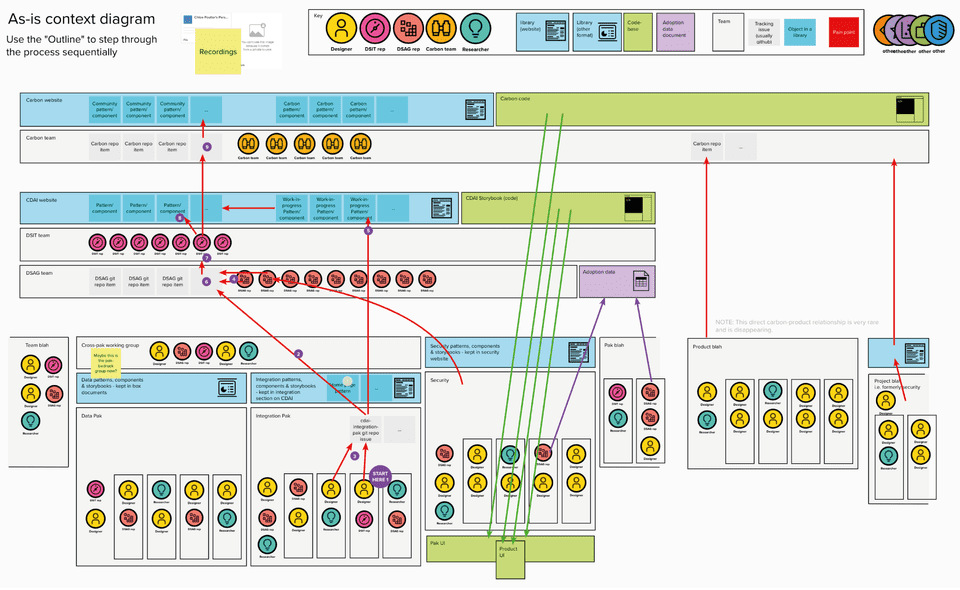
An asset I produced to help Integration designers navigate the complexity was a Context diagram.
In understanding the environment they are interacting with, designers now propose design ideas much earlier. I hope that this reflects a new sense of empowerment.
Case study: Notifications panel
I supported Integration designers to contribute a Notification Panel pattern.
A designer in IBM MQ shared designs for a Notifications panel, which would give MQ users the ability to view, clear, investigate and dismiss notifications, building on the existing toaster notification framework most integration products use.
At the integration designers’ group, we explored the designs and checked compatibility in each of the products as well as exploring how the experience would work in a Pak that combined products with user and role based access.
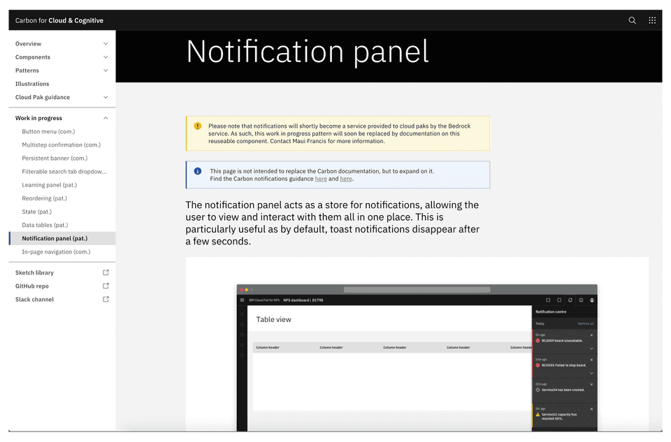
The designer didn’t have markdown and Github skills yet, so I coached her through writing high quality usage documentation in a Work-in-progress page on the Cloud & Cognitive site.
We presented the contribution to the Design System Adoption Guild and discussed thoughts from other Paks and groups extensively.
We incorporated notification models different than our own into a joint proposal, and expanded principles in the contribution to wider guidance for top-right navigation items.
Finally, when strategy changed, and Cloud Paks 2.0 and Bedrock was announced, we contributed our existing guidance to the Bedrock team, who are developing an embeddable notifications service to all Cloud Pak experiences.
It’ll be really exciting to see this component come to fruition as, with a single back-end framework, it has the ability to provide the most consistent component of experience across IBM yet.
3. Pattern guidance author & co-author
To date, I have authored and co-authored 14 patterns or components which are published in either the Carbon for Cloud and Cognitive, or Carbon Community libraries. These are:
- In-page navigation on Carbon for Cloud & Cognitive
- Create flows on Carbon Community
- Edit flows on Carbon Community
- Export on Carbon Community
- Generate an API key on Carbon Community
- Import on Carbon Community
- Remove and delete on Carbon Community
- File uploader on Carbon for Cloud & Cognitive (deprecated)
- Slide-in panel on Carbon for Cloud & Cognitive
- Slide-over panel on Carbon for Cloud & Cognitive
- Empty State on Carbon for Cloud & Cognitive
- HTTP Errors on Carbon for Cloud & Cognitive
- Notifications panel on Carbon for Cloud & Cognitive
- Saving on Carbon for Cloud & Cognitive
I maintain responsibility for the versioning and review of several of these patterns, while I consult on the future of others when they are picked up by new contributors.
Case study: Generate an API key
When I joined IBM Event Streams, reusable UI code, patterns and component libraries were just getting started.
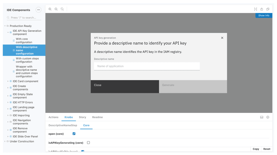
One of the pieces we contributed was the Generate an API key interaction.
While it might not sound like an obvious candidate for a repeatable UX interaction across IBM products, we discovered that many products did use APIs to authenticate the use of, or connections to the product.
The initial pattern specified guidance for a user to generate an API key either instantly, or after providing it a name.
After it was initially adopted by other products, we added guidance for situations where users needed to select which resources an API key authenticated access to.
In the third iteration of the product, I provided guidance for the context around generating an API key. I added guidance for teams who wished to fit the “generate” button into the rest of a page. We included examples, in scenarios where the generation and security allowed, the user might be able to return to view guidance while still seeing the key.
The really exciting part happened when Cloud, Data & AI consolidated with Security.
Working with patterns authors for security, we expanded the Generate an API key pattern to guide designers on two more experiences: the API key management page and Edit an API key.
I really enjoyed receiving Security’s feedback on our pattern so far, because they helped me make two improvements:
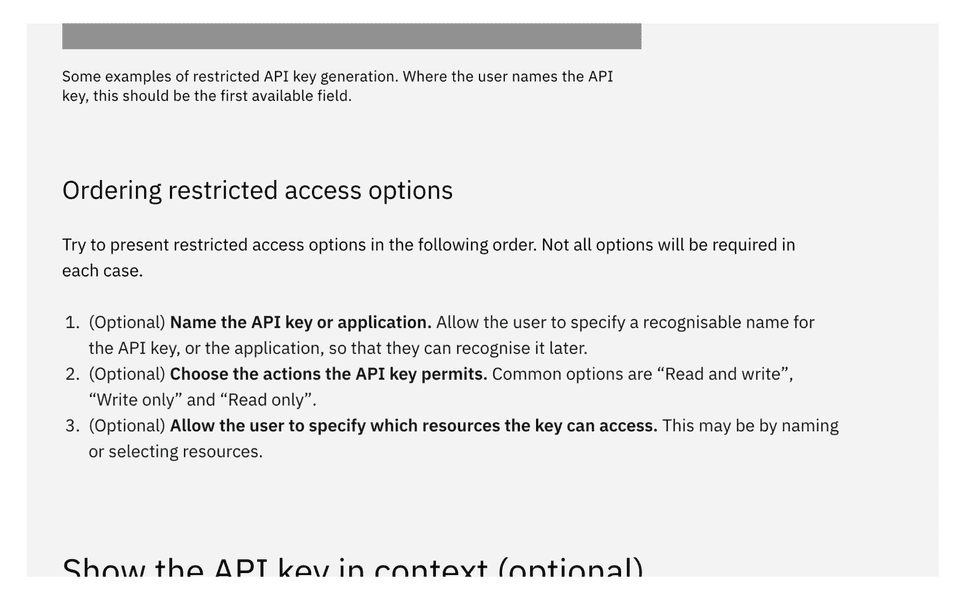
- We developed guidance for the order that restricted-access API key generation took place. This means that now, all options in generating an API key should follow the pattern of specify name, specify actions, and specify resources.
- We wrote warnings that are much more specific to the retrieval scenario. Aware that getting hold of API keys is a varied (or non existent) experience depending on product and platform, we drafted three consistent but clear messages designers can use to convey the retrieval method.
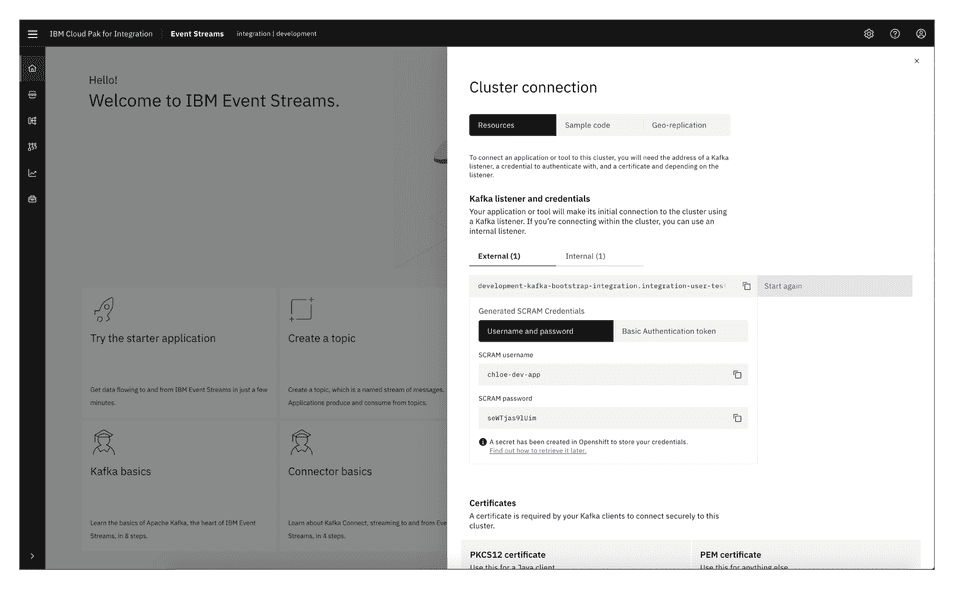
Finally, I learnt how to consume and test my own pattern when IBM Event Streams changed authentication methods.
While Event Streams had always used API keys to connect consuming applications, a change in technology meant a change in authentication methods.
In the new world, a Kafka user (a term representing an authenticated connected application) might use either SCRAM credentials or TLS certificates to connect.
This meant pushing the Generate an API key pattern to its’ limits.
We tweaked the “Generate” button to specify a credential type, used modal subtitles to retain context for the user as they followed the generate flow, and abided the ordering of restricted-access options to maintain the consistent experience while adopting significantly different technology.
This taught me a lot about how patterns should be written. To this day, I return regularly to examine the user intent behind actions at one depth, and another, and another. Following this pattern through its development, and consuming it myself, has truly led me to believe that if the pattern guidance respects the users’ goal in the interaction, it can be adopted for any use case, no matter how complicated.
